Saturday, February 27, 2010
viscom2: post crit thoughts
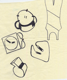
upon critique yesterday i learned which icons needed further revisions. i was not surprised when my jump rope and scale were pointed out. both were pointed out for legibility of the objects, the rope mistaken for a fire extinguisher and the scale as a clip board. based on the previous difficulty i have i had i am thinking about pursing a stand up medical scale instead of a flat "old school" design. this would not only ensure legibility of the object but also re-enforce my story by being a more accurate type of scale. as for my jump rope i have few ideas that jamie and i had come up with early this week that should help me find a more successful solution.
Friday, February 26, 2010
Thursday, February 25, 2010
viscom2: documentation of icon project
my icon set that will be submitted for final review.
deciding to switch to a more geometric based set, i found the maturity that i was looking for. after this final critique i was aware of which objects needed change, mostly to ensure cohesion throughout my set.
the first category of icons that i approached to build on was the outline-based icons. upon the feedback that i received from my instructor i decided that my icons had no personality and seemed childish.
once i iterated the objects into there final solid forms (top row) i then altered them to fit into numerous categories such as outline, organic and geometric forms, exaggerated feature and framing.
once i had a general idea of the shapes i wanted to use for each object i then went to the tracing paper to began to iterate each idea.
some of my initial quick sketches that i did to prepare for the creation of my icon set. doing this exercise let me explore the basic contour shapes of my objects, which guided me into my first round revision.
Tuesday, February 16, 2010
image: proj2
for my photography project i chose randy rhoads, the original guitarist for ozzy. he died in march of '82 in a plane accident. the quote i chose was a quote from rhoads just shortly after auditioning for ozzy in a hotel room.
"i just showed up and did some riffs and he said you got the gig"
the objects that i am photographing to describe rhoads are listed below
1. signature flying-v guitar
2. polka-dot pattern
3. jackson guitar logo
4. guitar knob
Monday, February 15, 2010
type2: change one thing
here are my corrected posters from friday evenings critique.
elements i corrected included the saturation of my image and how i dealt with the placement of my statistic.

after looking my final poster ideas i am already seeing a few things that need to be altered. i also want to look back at a previous idea of having the icon foreground larger and more centered on the page but still at an angle.
Thursday, February 11, 2010
pictogram & ionic lion reading
upon reading the article about the pictogram's history i discovered that we are being brought the same problem in class. much like the problem of needing a successful way to communicate transportation signs we are creating a system of icons to communicate a story.
while looking through the sketches and design process of the new NYCL logo i can tell that are process for creating our icons are very similar. they started with a rough black and white depiction and began the long process of iterations. during those iterations they decided to simplify the lion down to organic shapes and place it into a circle to give it a background.
Monday, February 8, 2010
Subscribe to:
Comments (Atom)


