my icon set that will be submitted for final review.
deciding to switch to a more geometric based set, i found the maturity that i was looking for. after this final critique i was aware of which objects needed change, mostly to ensure cohesion throughout my set.
the first category of icons that i approached to build on was the outline-based icons. upon the feedback that i received from my instructor i decided that my icons had no personality and seemed childish.
once i iterated the objects into there final solid forms (top row) i then altered them to fit into numerous categories such as outline, organic and geometric forms, exaggerated feature and framing.
once i had a general idea of the shapes i wanted to use for each object i then went to the tracing paper to began to iterate each idea.
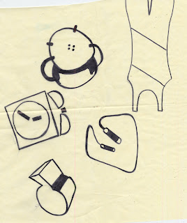
some of my initial quick sketches that i did to prepare for the creation of my icon set. doing this exercise let me explore the basic contour shapes of my objects, which guided me into my first round revision.


No comments:
Post a Comment