Friday, May 7, 2010

images: proj5

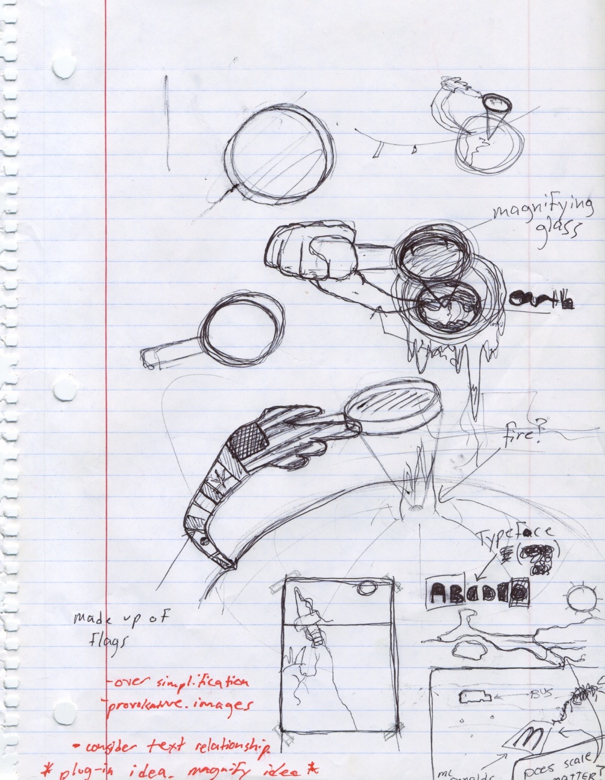
after deciding that it would be more interesting to use the magnifying glass to zoom in and reveal information about the future we began to design for each piece. this was our first look at how we could use a simple crop of our magnifying glass and effective typography to create an interesting, cohesive composition.


this was our original idea for the front cover of our dvd case. it consisted of a forrest and a magnifying glass revealing a burning fire.


these were our first two iteration for poster ideas. the top poster depicts how if we continue to use these consumer friendly based plastics it will only turn into garbage.

the second idea is trying to suggest our overproduction and consumption of meat products will eventually lead to destruction.

images: proj5 digital iteration


for our dvd menu we had to incorporate a moving image. we chose to again incorporate our magnifying glass. we used it to reveal another image from behind the background image. this added extra meaning behind the contrasting images of an ocean and dried dirt.


our first digital iteration of our dvd label


a first digital iteration experimenting with the use of imagery and an icon magnifying glass made up of icons. this was meant to symbolize the idea that everyone has there own small part in global warming .

images: proj5 iterations


this was our original idea for our poster and dvd cover. it was a conceptual concept that refers to how we are instead of killing ants with heat, we are allowing global warming happen and burn ourselves. the magnifying glass is also meant to give the viewer sight at what is going to happen if something doesnt change. a burning forest.

our first concept that used this magnifying glass was based on a narrative. while the cover gave us a shot of the magnifying glass, the dvd label focused on the point that was becoming heated up and starting on fire.

the last part of the narrative was the after math, the burnt hole in the paper that signified the world after a full change in 6 degreees.

Thursday, May 6, 2010

images: proj5 sketches


from the beginning bryan and had an idea in which we used a magnifying glass. one idea that we had was based on the idea of using a magnifying glass to burn ants. we took this concept and applied it to global warming. we also had a concept that used the glass to magnify the earth to reveal the effects of global warming inside of it.


another idea that we were sketching out was the use of electrical cords, using them in a way that would depict the over-use and waste of energy.


these were a few early iterations on the idea of using the glass to burn the earth. in these sketches you can see how we considered the use of the glass with a hand that could represent the population as a whole.

Monday, May 3, 2010

viscom2: icon combinations overlook

multiple icons/ amplified
this pattern is successfully generating visual pattern by the use of color and rotation. the alternation of large trophy icons contrast well with the smaller icons in its complimentary color of blue. i was looking towards the next steps of the project by thinking conceptually with this pattern. the negative space between the icons and the focal point that is created by the large icons help create the connotation of movement and fast pace atmosphere of any wrestling tournament.

multiple icons/ harmonious
this dense pattern is made up of my trophy and clock icon. this combination of icons creates a clear communicational message. this pattern is telling the viewer if you put in the hours of practice you will be a rewarded with the trophy, you will be a champion. the strong visual language that is being produced made for more interesting image and text combinations in my later exercises.

single icon/ harmonious

this pattern is probably the most structured. its density and short pattern makes it easy for the viewer to see its visual pattern, although its contrast in color, scale and direction brings it a level of sophistication that causes more visual interest. its symmetry makes it harmonious which also helps creates a visual language with the viewer.

viscom2: semester reflection

at the beginning of the semester i chose wrestling as my story topic and direction for icon development. im glad i picked a topic that i am passionate about, it kept me wanting to push my icons and their concepts.

the initial part of the semester that was dedicated to the development of our icon sets was by far my favorite part. i really enjoyed getting to research my objects and finding pictures in which to sketch them. drawing has always been a strength of mine, so i will try to continue to use it in my work. the process we were instructed to follow during this time was very helpful in learning to successfully create icon sets and then apply them to numerous functions, from our initial mind maps to the loose/ refined sketches to the pages and pages of matrixes.

i thought the most difficult part of the semester and this project was the creation of our information graphics. finding a legible way to display lots of information is a controlled space while keeping the design visual pleasing was rather hard. this was my first time at creating one so for the first couple days i did a lot of researching on the net, studying hundreds of infographics to try and get inspiration for the one i would be creating and to just get a better understanding of their structor and content.

i hope next semester i will continue to learn new ways to improve my process in which i work, like finding times i can get off my laptop to work with my hands.

Wednesday, April 14, 2010

image: proj4

my final portfolio images for my book "singular"