Friday, May 7, 2010

images: proj5

after deciding that it would be more interesting to use the magnifying glass to zoom in and reveal information about the future we began to design for each piece. this was our first look at how we could use a simple crop of our magnifying glass and effective typography to create an interesting, cohesive composition.


this was our original idea for the front cover of our dvd case. it consisted of a forrest and a magnifying glass revealing a burning fire.


these were our first two iteration for poster ideas. the top poster depicts how if we continue to use these consumer friendly based plastics it will only turn into garbage.

the second idea is trying to suggest our overproduction and consumption of meat products will eventually lead to destruction.

images: proj5 digital iteration


for our dvd menu we had to incorporate a moving image. we chose to again incorporate our magnifying glass. we used it to reveal another image from behind the background image. this added extra meaning behind the contrasting images of an ocean and dried dirt.


our first digital iteration of our dvd label


a first digital iteration experimenting with the use of imagery and an icon magnifying glass made up of icons. this was meant to symbolize the idea that everyone has there own small part in global warming .

images: proj5 iterations


this was our original idea for our poster and dvd cover. it was a conceptual concept that refers to how we are instead of killing ants with heat, we are allowing global warming happen and burn ourselves. the magnifying glass is also meant to give the viewer sight at what is going to happen if something doesnt change. a burning forest.

our first concept that used this magnifying glass was based on a narrative. while the cover gave us a shot of the magnifying glass, the dvd label focused on the point that was becoming heated up and starting on fire.

the last part of the narrative was the after math, the burnt hole in the paper that signified the world after a full change in 6 degreees.

Thursday, May 6, 2010

images: proj5 sketches


from the beginning bryan and had an idea in which we used a magnifying glass. one idea that we had was based on the idea of using a magnifying glass to burn ants. we took this concept and applied it to global warming. we also had a concept that used the glass to magnify the earth to reveal the effects of global warming inside of it.


another idea that we were sketching out was the use of electrical cords, using them in a way that would depict the over-use and waste of energy.


these were a few early iterations on the idea of using the glass to burn the earth. in these sketches you can see how we considered the use of the glass with a hand that could represent the population as a whole.

Monday, May 3, 2010

viscom2: icon combinations overlook

multiple icons/ amplified
this pattern is successfully generating visual pattern by the use of color and rotation. the alternation of large trophy icons contrast well with the smaller icons in its complimentary color of blue. i was looking towards the next steps of the project by thinking conceptually with this pattern. the negative space between the icons and the focal point that is created by the large icons help create the connotation of movement and fast pace atmosphere of any wrestling tournament.

multiple icons/ harmonious
this dense pattern is made up of my trophy and clock icon. this combination of icons creates a clear communicational message. this pattern is telling the viewer if you put in the hours of practice you will be a rewarded with the trophy, you will be a champion. the strong visual language that is being produced made for more interesting image and text combinations in my later exercises.

single icon/ harmonious

this pattern is probably the most structured. its density and short pattern makes it easy for the viewer to see its visual pattern, although its contrast in color, scale and direction brings it a level of sophistication that causes more visual interest. its symmetry makes it harmonious which also helps creates a visual language with the viewer.

viscom2: semester reflection

at the beginning of the semester i chose wrestling as my story topic and direction for icon development. im glad i picked a topic that i am passionate about, it kept me wanting to push my icons and their concepts.

the initial part of the semester that was dedicated to the development of our icon sets was by far my favorite part. i really enjoyed getting to research my objects and finding pictures in which to sketch them. drawing has always been a strength of mine, so i will try to continue to use it in my work. the process we were instructed to follow during this time was very helpful in learning to successfully create icon sets and then apply them to numerous functions, from our initial mind maps to the loose/ refined sketches to the pages and pages of matrixes.

i thought the most difficult part of the semester and this project was the creation of our information graphics. finding a legible way to display lots of information is a controlled space while keeping the design visual pleasing was rather hard. this was my first time at creating one so for the first couple days i did a lot of researching on the net, studying hundreds of infographics to try and get inspiration for the one i would be creating and to just get a better understanding of their structor and content.

i hope next semester i will continue to learn new ways to improve my process in which i work, like finding times i can get off my laptop to work with my hands.

Wednesday, April 14, 2010

image: proj4

my final portfolio images for my book "singular"


image: proj4 response

this last project was the first in which we were allowed to used photoshop to help compose our work. this way of working rather than all in camera is a completely different process of doing things. i believe finding the right balence of working between these two methods will be where successes will be found in my image making.

image: proj4

my final book-jacket layouts for image class.


Friday, April 9, 2010

viscom2: final statment


i created my info-graphics by researching what i would be interesting facts about my subject, wrestling. i chose the ncaa national tournament as my main idea an then found lots of facts about it and its participants throughout history. My most interesting facts about the tournament ended up not having so much to do with my icon set. how was i suppose to use wrestling objects to portray individual cities? in order to most successfully incorporate my icons into my graphics i decided to use my trophy as the most winningest team.

when i was first told that i needed to incorporate temporal, spatial and numerical comparison information into our graphics i was excited because i wanted to pack these three things into one graph. what i didnt realize was that i could do so and still have such a simple graphic. with my main info-graphic about the number of national titles each time has won, i chose to display my temporal information by setting up a line graph to show which team had won which year. I also showed space by setting my icons up on a map of the united states and i compared numerical information by showing a comparison in the number of rings around each icon. i also showed this through scale and hierarchy.

to gain sensibility in typography i spent a lot of time looking through different magazine articles. i looked through mostly gq, details and sports illustrated to find articles whose topics were similar to mine. i looked a lot at how they designers expressed meaning about the content through their typography. when looking back at my use of color i was mainly using it for aesthetic purposes, i could have better incorporated them by having them function as a measure of hierarchy or as and identification of something. i think i overall used hierarchy pretty well within my infographicss. in my first graphic i used a combination of scale, quantity and positioning on the page to convey hierarchy to the viewer. when designing my info graphic i wanting to use some kind of compositional element to further my design. i thought if i had a bit larger top margin on the page i could use that space to fill with a graphic to create even more engaging information graphics. the majority of my compositions where based on my margins and placeent of info graphics. i thought by using my margins to place graphics and images it would allow for a more engaging spread, not just consistancy in white space throughout.


Sunday, April 4, 2010

image: proj4

this was my first digital look at my jacket series with full color and images. while looking at my spreads recognize how i chose to crop each image. by cropping out each person to the point of them being unrecognizable i am trying to conceptually tell the viewer something about the series, that its about wrestling but can/is meant to be looked at from other sports perspectives.

after crit friday i found out that my cropping technique, especially in this one of ripped chest is working well.


in crit we discussed my stylistic choice to frame my title and sub-title. does it carry additional meaning about my book series? this is what i have learned the most up to this point in image class. tyler is constantly making us think conceptually, making us ask ourselves, "does this add extra meaning to our work? does this make sense with my concept?"

based on my feedback from crit i am currently thinking of new ways to incorporate my color scheme in another way. right now between my spreads combination of duo-toned images and saturated spaces of color it is distracting for my viewer to look at.

image: proj4

the two magazines i used to find my images were gentleman's quarterly and details. my thoughts about images were that i wanted them to literally convey what my books are about, although i wanted to execute this in still a way that would still provoke the viewer to think.

sports conditioning,


making weight,


water,


healthy eating,


image: proj4

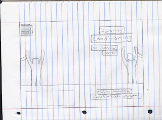
a few sketches incorporating my ideas into a single concept. although i chose to depict one concept i still iterated within the idea on certain formal elements such as my silhouette.


image: proj4

my 4 topics i chose to include in my series were water, healthy eating, sporting conditioning and weight management.

some initial brainstorming i had done to generate ideas for my book-jacket series


from the beginning i new i wanted to use a bar horizontally across the covers to separate text and image. the difficult decision i had to make was how could i incorporate something into this graphic tool that would have meaning relating to my series. i came up with the idea of using a silhouette of an wrestling official to relate to my series. this not only brings further meaning to my design but it also creates extra visual interest but pulling the flat color into my image.


mind-mapping is a great way i was shown to get lost of ideas out of my head in a short amount of time. i used this map to generate ideas about wrestlers and losing weight.

Friday, March 12, 2010

image: proj3 review

ill have my final photos up, along with a few new shots that i have already taken in response to my book.

since the beginning of the project i have felt my concept was strong. although i knew what my obstacles were going to be. mainly the fact that i have no clue in fully understanding how a camera works. on top of that the fact that i dont have a high-end camera and the poor lighting conditions i was faced to shoot in.

after i had downloaded my experimental photos and got a look at the saturated kinda slightly blurred effect that i was getting. this was how i got the idea to try and control the results that i was getting. the progress critiques are very important and i tried to utilize his time better by skipping some of my usual sketching drills and went straight for my camera. having a variety of work for my image instructor to look at, along with my other two, gives me a better chance for success.

viscom2: final color & bw icons


my final b&w icon set, minus my jump-rope. i am still unable to render it in a way that is BOTH legible and cohesive with the rest of my set. major changes have been on the scale and singlet . i needed to make the scale legible when scaled down so i made changes to the stroke weight of the tick-marks and hand. my singlet was too tall and skinny so i made slight adjustments to widen the overall shape.


my final set of color icons. i really like the idea of offsetting the icon on top of a solid version of itself. i thought this technique worked well with my choice of "knock-out" style icons.

Monday, March 8, 2010


my second round of color swatches that i produced after critique. i think my color combinations are getting closer to carrying the connotations that i want them too. i like the fourth set from the bottom, the contrasting orange and blue give my icon a vibration feel that i think is working well with the constant motion and business aspect of my narrative.

viscom2: color swatches & icons


my five pictures that i chosen to take swatches from. i decided to take bright
"school color-like" samples that i thought could capture the feeling of a wrestling tournament.


here are my first color comparisons with the three different techniques i was choosing from.

after discussion in class i learned that my colors where to "crayola box" like. we went through each color swatch that we chose and listed general connotations of that color that came to mind. connotations of a wrestling tournament included aggressive, busy, noisy and strength. colors that i feel i could use in order to show these things are dark blues reds and bright oranges.

viscom2: colour


my first look into adding colour to my icons. i organized my techniques of applying colour to my icons into a matrix, just as i did when creating them previously.

after looking at each direction jamie and i came to the decision that i should pursue the direction of adding a backdrop shape, which is the 5th row from the top.

Wednesday, March 3, 2010

image: proj3

my initial ideas both include hands. one idea is more focused on a first-person view, as if the viewer is looking at their own and hands committing the deadly sin.

my 2nd idea is much more of a humorous attempt. i want to try and paint faces on my hands to make the look like a person. i would then use these subjects to act out each of they deadly sins.


these are my initial sketches for my first person view idea. each composition consists of a pair of hands and another object or two. my objects that i am considering using for each sin are the following:

gluttony: oreos/cream & milk
lust: pornography magazine & lotion bottle/phone
wrath: computer screen & pencil
greed: coins
envy: torn photograph
sloth: bong & lighter
pride: fingernail file & clippers


image: proj3

our assignment for project 3 is to take 7 photographs that successfully illustrate the seven deadly sins. the photos must be taken from camera meaning no photoshop. they also will be constructed into a 8"x6" accordion-fold book.


Saturday, February 27, 2010

viscom2: post crit thoughts

upon critique yesterday i learned which icons needed further revisions. i was not surprised when my jump rope and scale were pointed out. both were pointed out for legibility of the objects, the rope mistaken for a fire extinguisher and the scale as a clip board. based on the previous difficulty i have i had i am thinking about pursing a stand up medical scale instead of a flat "old school" design. this would not only ensure legibility of the object but also re-enforce my story by being a more accurate type of scale. as for my jump rope i have few ideas that jamie and i had come up with early this week that should help me find a more successful solution.