
multiple icons/ amplified

this pattern is successfully generating visual pattern by the use of color and rotation. the alternation of large trophy icons contrast well with the smaller icons in its complimentary color of blue. i was looking towards the next steps of the project by thinking conceptually with this pattern. the negative space between the icons and the focal point that is created by the large icons help create the connotation of movement and fast pace atmosphere of any wrestling tournament.
multiple icons/ harmonious


this dense pattern is made up of my trophy and clock icon. this combination of icons creates a clear communicational message. this pattern is telling the viewer if you put in the hours of practice you will be a rewarded with the trophy, you will be a champion. the strong visual language that is being produced made for more interesting image and text combinations in my later exercises.
single icon/ harmonious
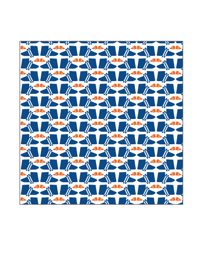
this pattern is probably the most structured. its density and short pattern makes it easy for the viewer to see its visual pattern, although its contrast in color, scale and direction brings it a level of sophistication that causes more visual interest. its symmetry makes it harmonious which also helps creates a visual language with the viewer.
No comments:
Post a Comment